
FS Me: ‘The accessible type’
FS Me is a typeface family designed by Jason Smith of Fontsmith. Developed with Mencap, a leading UK charity for people with learning disabilities, it was designed to meet, and then exceed, the recommendations of government accessibility guidelines. FS Me aimed to become a typeface which could be used across the scope of communication design — not an accessible typeface for a specific audience but an inclusive typeface for everyone.
“FS Me helps me understand things that I read. If I understand more I feel more independent.” — Lorainne Bellamy, Mencap Research Panel
Accessibility, when it comes to communication design, is about providing access to content, making design choices which actively aid understanding through legibility and readability. This is particularly important for people with learning difficulties, who may find some typefaces hinder their reading experience.
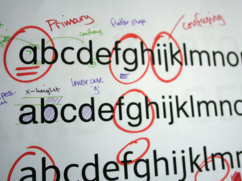
Image credit: Fontsmith
Accessibility guidelines typically recommend using a sans serif typeface like Arial at a minimum of 12 points. This can be challenging on a practical level because of space constraints, and in terms of context because sometimes Arial, in fact usually Arial, is not the most appropriate choice for every project. To fall back on such homogeny when it comes to selecting a typeface for its accessible qualities does not do justice to the reader, whoever they may be.
The FS Me project set out to meet the needs of both the designer and the reader.
Image credit: Fontsmith
Keeping in mind that there are many different types of learning disabilities which can affect reading in different ways, there are some challenges that are common, and were highlighted by the research that FS Me is built on. For example:
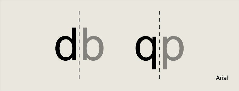
Distinguishing between certain characters, particularly bs from ds and ps from qs can be challenging for some readers. Many typefaces simply reflect these characters and give no other clues to distinguishing between them.
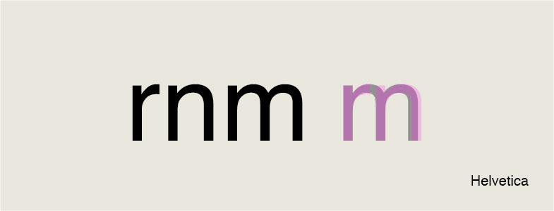
Reading letter combinations. The difference between ‘rn’ and ‘m’, for example, can be difficult to make out.
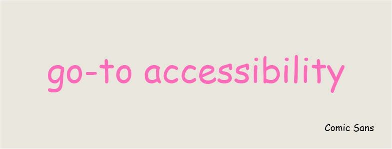
The perceived warmth or friendliness of certain fonts, like Comic Sans (above), often makes them popular choices when it comes to making accessible materials, rather than whether they are appropriate for the age and context of the reader. But being accessible does not mean being casual or childish.
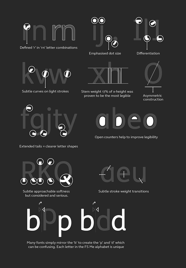
Image credit: Fontsmith
In response to these issues FS Me was designed with:
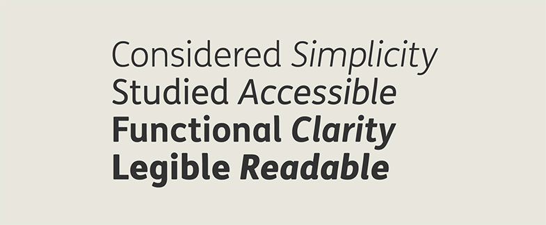
More open counters and a focus on accentuating distinct character elements to help in quick and clear identification. This is most apparent in the extended ascenders and descenders, serifs on the capital I, and larger than average dots on the i and j.
A carefully determined stroke width in FS Me Regular weight to aid legibility based on project research.
Differentiation of forms, like the rounder curvature of the r which, when preceding an n, is less likely to be read as an m.
The choice of single story ‘handwriting-style’ a and g, as opposed to double story characters.
A warmth and friendliness which comes across in the slight rounding off of terminals, but isn’t exaggerated to the point of being childlike.
FS Me is about design that doesn’t patronise. People with learning disabilities are often treated as inferior by childlike design. FS Me is designed for adults, not children – a beautifully-designed font for everyone. — Fontsmith
The project didn’t lose sight of standards that make it a viable, commercial typeface — perhaps the key to its success as a widely used and desired typeface across sectors and contexts. The family has several weights and standard as well as pro versions, making it versatile for such wide usage.
Tested by the target readers, developed from the insights of sector specialists, and designed by type professionals, FS Me is good example of what it means to design with not for people. Collaboration, but not compromise, which didn’t lose sight of the design rigour that should be applied to all typeface design, for everyone.
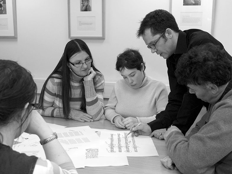
Image credit: Fontsmith
