
The Refugee Project: Making data meaningful
Each year, tens of thousands of people are forced to abandon their homes to save their lives. Whether they are fleeing war, natural disasters or persecution, when they cross international borders, they become refugees. The Office of the United Nations High Commissioner for Refugees leads the international effort to safeguard the rights and well-being of refugees. The agency works with over 35 Million displaced persons, across more than a hundred nations on Earth collecting vast troves of data in the process. Though this data is published publicly, the scale and complexity of the information makes it inaccessible to anyone but the most determined journalists and academic researchers.
The Refugee Project is a self-initiated effort by New York based Social Impact Design agency Hyperakt and Artist and Designer Ekene Ijeoma to make this valuable information easy to understand and simple to navigate. The interactive map tracks almost all significant migrations of displaced people in the last forty years, enabling a narrative, geographical, and temporal understanding of the crises.
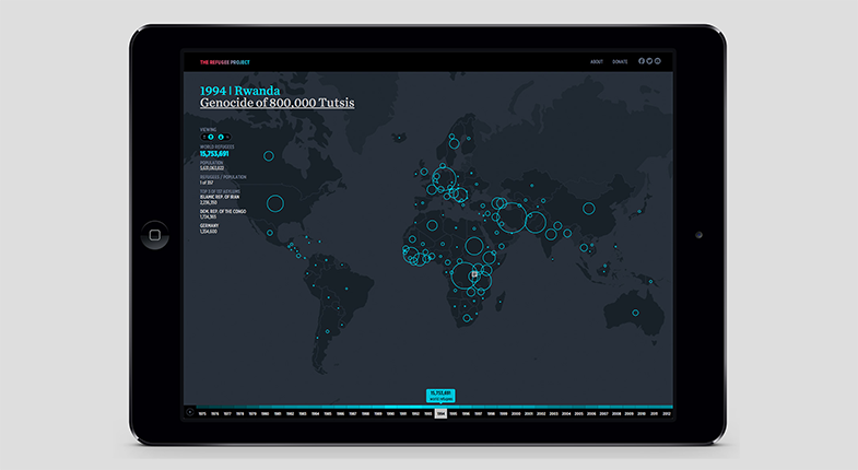
The primary interface is constructed of three key elements: A timeline grouping crises by year, a heat map of refugee numbers overlaid onto a world map, and a headline highlighting key world events that year that contributed to or impacted a refugee crisis. These three components come together to create a sort of ‘dashboard’ overview of refugee crises, allowing you to grasp the scale and context of a crisis (in brief) quickly, while making it easy to drill deeper to find specific information.
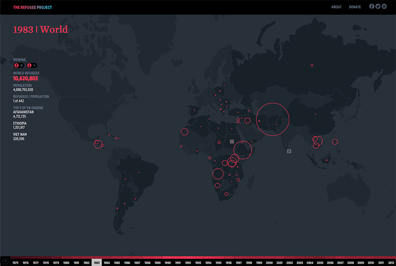

Selecting a year populates the world map with a heat map overlay of circles of varying radii depicting the number of refugees originating from that country, while an information console on the side-bar lists figures and additional contextual information. The accompanying headlines and crises summaries, original content created for the site, echo the simple yet deep ethos of the rest of the tool.
Clicking anywhere on the map brings up information specific to that region, with lines radiating outward connecting it with the nations providing asylum to the affected people.

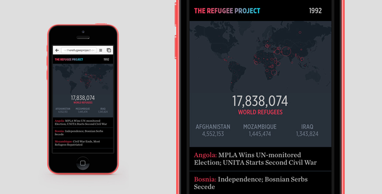
The interface on mobile devices is pared down even further, displaying the three countries with the highest number of refugees for any year, as well as the top three countries providing asylum, accompanied by links to more information.
The project has been received with near unanimous praise, with recognition from the New York MOMA, Design Museum London, and more, as well as worldwide press coverage and approval from organisations such as Amnesty International, the UNHCR, Oxfam International, and Human Rights Watch.
Making things visible is making things actionable.
The Refugee Project’s simplicity is its greatest victory. By giving visual form to such a large dataset, the tool enables even laypeople to make meaning of complex information, and enables insights that would otherwise have been apparent only to statisticians and academics. For instance, in light of the ongoing rhetoric surrounding the refugee crisis in Syria, I was surprised to see that the trend of refugees moving from developing to developed nations is, in fact, going the other way: some 85%+ of refugees from the developing world today find refuge in neighbouring countries, as opposed to a decade year ago, when the number was nearer 70%.
The project has even inspired others to create inspirational and interpretive works of their own, one great example being programmer and artist Brian Foo’s “Distance from Home” project, that uses algorithms to generate musical notes from the UNHCR data.
For more reading on the project, as well as works inspired by it, see:
Hyperakt case study
Design & Violence: MOMA
Design for Conflict Heritage
